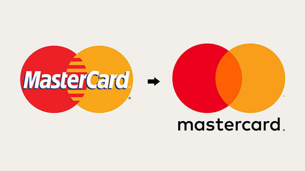
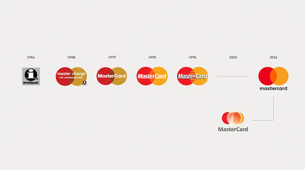
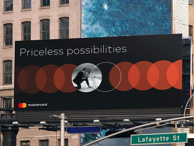
Mastercard has one of the most iconic logos in existence. An estimated 2.2 billion cards carry the famous overlapping red and yellow circles, so when the company decided to redesign it for the first time in 20 years, they needed a logo that would maintain the essence of the original while at the same time ensuring that it reflected the modern age in which we live.
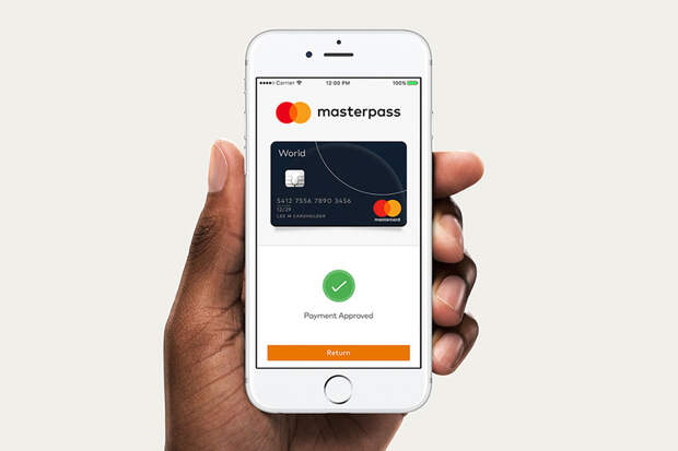
And as you can see from the result, they seem to have achieved just that.The minimalist overhaul came courtesy of Pentagram, a design studio headquartered in London who decided upon a simpler visual that, according to a press release from Mastercard, is “modernized and optimized for an increasingly digital world.” The modern revamp was unveiled on 14 July 2016 and is set to complement Mastercard’s new digital payment system called ‘Masterpass.’
As well as Mastercard, Pentagram have also redesigned a number of other famous logos including DC Comics, PBS talk show, and the London Underground.
More info: Mastercard | Pentagram